Hello, lovelies! Long time, no see read... (that sounded more funny in my head!). Please ignore my rusty first line, it's been so long since I've written a post intro and I was never particularly good at them in the first place :D If you follow me over on Instagram, you may have seen my gorgeous new planner! I recently shared a photo of it, and promised to blog all about it, so here we go. FYI: I'm obsessed with it already!
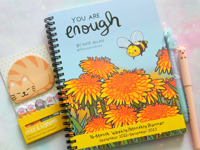
LOOK AT THAT COVER! Isn't it the most adorable thing you've ever seen!? That tiny bumblebee now fills me with happiness every single day. Most of my readers are also fellow lovers of the cute things in life, so will likely recognise the artwork style right away, but if not, Kate Allan, aka The Latest Kate, is the artist and you seriously need to give them a follow over on Twitter and Instagram, because their art is the loveliest, with each piece featuring a cute creature along with a signature uplifting quote. With the world seemingly getting more and more crap each day, seeing these types of wholesome messages is even more important for our mental well-being, and so what's better than a planner filled with them? Sometimes venturing online can be overwhelming, for so many reasons, and so being able to see Kate's artwork without logging onto social media has been great!
I am so impressed with this planner that I just had to share all about it, and give you all my first impressions, plus show off the pages you will find inside :)
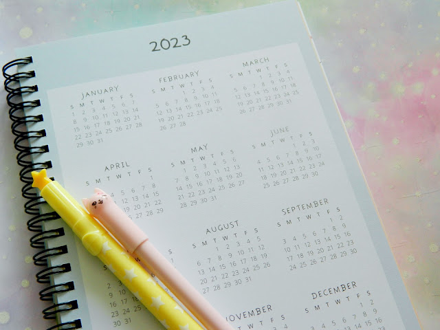
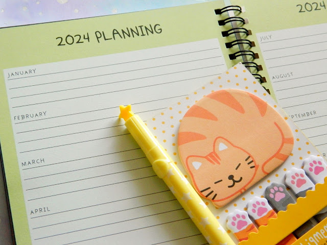
The next page you will find inside the planner is a 2023 overview calendar. I've never required my planners to have sheets like these, as there's not really space to make a note next to the dates and I am a perpetual over writer! However, I'm sure lots of people find them very handy to be able to circle important dates to remember, that they can make a more detailed note of elsewhere in the planner. The back of the planner includes two more pages like this one, one for 2022 and another for 2024. Personally, I would have liked all three of these pages to be grouped together, especially because the 2022 one is at the back and easy to forget about as its located after the main planner pages. Maybe using this page will prompt me to be more organised when it comes to planning things in advance :)
Something that I find adorable about this planner is that so many of the pages are in pastel colours! As a fan of kawaii culture, something that is very much pastel in aesthetics. I find this so visually appealing. I also feel like it will help my writing to stand out more, than if it was surrounded by darker shades, if that makes sense. I've always had a tough time sticking to writing in planners daily, so little things like this can really make a difference for me.
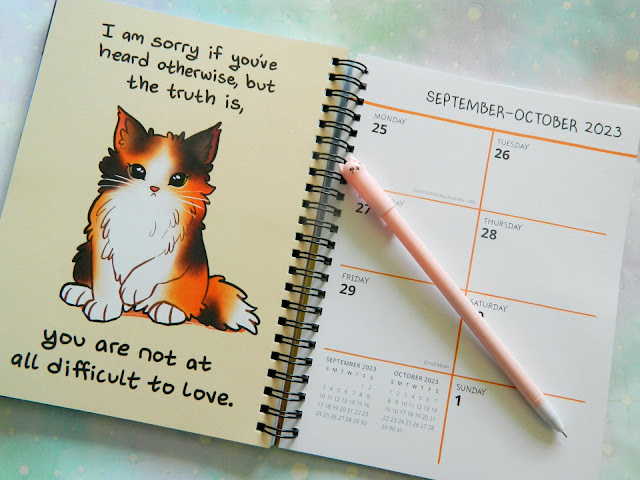
After the calendar overview page, you will find monthly calendars, with a box for you to jot down notes for each date. These are the type of calendars that I much prefer as I can jot down people's birthdays, appointments, etc. As the You Are Enough planner runs from September 2022 until December 2023, these are the dates included for the monthly section, with each one being in a different pastel shade. They note important holidays and special days from across the world, such as Diwali and Earth Day, as well as the different moon phases, which is one of my favourite features. I love to take photographs of the full moon :)
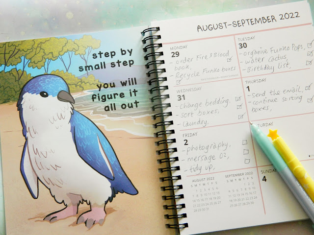
Cute bird alert!! The next section of the planner is where all of the beautiful artwork begins! Of course, the large majority of the planner is made up of weekly pages, with each of the seventy weeks being accompanied by an A5 print of Kate's art, and oh my gosh, they are all such a joy to look at! I am super happy with how spacious the weekly pages are; there's lots of room to write in each box, and I'm very glad to see that Saturday & Sunday have an equal amount of space. I've bought so many planners in the past that have made the weekend into one bigger box, and it's so frustrating!
The only detail I would personally change about the weekly page set up is that the bottom left corner space is taken up by a mini calendar. Again, this may just be because I am not a fan in general of these number calendars, where you can only highlight a key date, but I would have liked to see a blank box, maybe titled as 'notes' so I could jot down extra things, or even just have a blank square to decorate with stickers, washi tape and/or a little doodle or something. What do you guys think?
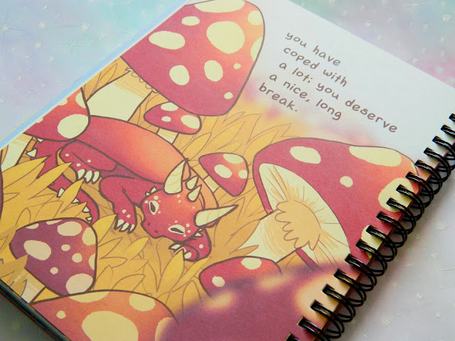
I love that there's a variety of different colour schemes and themes included throughout this planner. One page may have a super colourful, bright illustration of a dragon, and the next has a couple of foxes coloured in calm shades of blue and purple. It's so wonderful! Such attention-to-detail has been put into these designs, with some of the themes matching up with the season. There's a pretty bird sitting in a pink blossom tree in the April section, for example. The margins/grids for each weekly page are a different colour, which is a very nice touch.
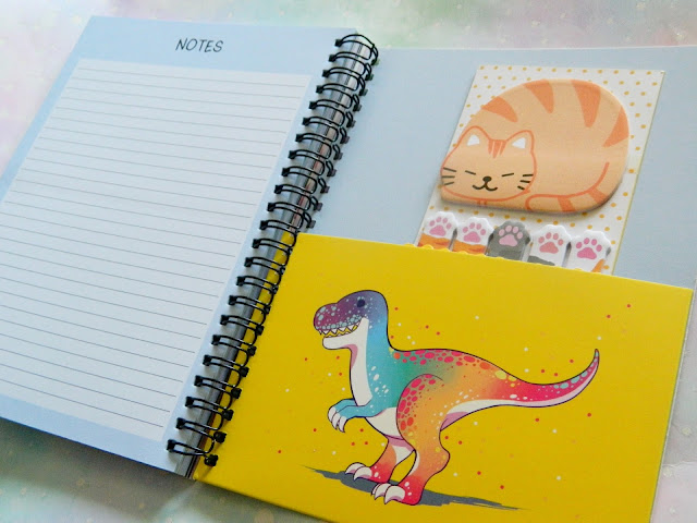
The final section of the You Are Enough planner is made up of notes pages. I counted thirteen sides, so there's lots of room! I'll probably use these pages to write up detailed plans for special events, like if I'm going somewhere for a day out, I might make a note of important details such as addresses and local attractions, stuff like that. All of the note pages are blue, which for some people will be preferred as it categorises the section. I think it would have been cool to have these pages in different colours to keep in with the colourful theme of the rest of the planner, but the colours of the pages don't impact the functionality of the planner. It's fantastic regardless of my thoughts about little feature changes.
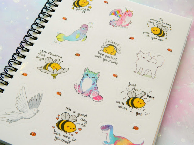
Check out the sleeve/pouch on the back page of the planner!! It's so eye-catching being in vibrant yellow and with the most fabulous multi-coloured dinosaur, that matches one of the stickers at the start. They're iconic and I've named them Nijiro. Nijiro will now be the handy guardian of my cute little planner tabs and stickers! I really love how the yellow contrasts with the muted blue tone of the notes pages, Like bam! it's a surprise dino!
♥
